
Eagles Landing Health Website
Client: Eagles Landing Health [Network]
Wireframes: Chelsea Daffinson
Comps + Designs: Ariel Chapman
When I worked for Between Pixels, Eagles Landing Family Practice (now Aylo Health) had expanded tremendously. This project in particular though, took an extreme amount of brain power and…well, definitely taught me patience.
*Wireframes were updated to reflect mockups throughout their evolution
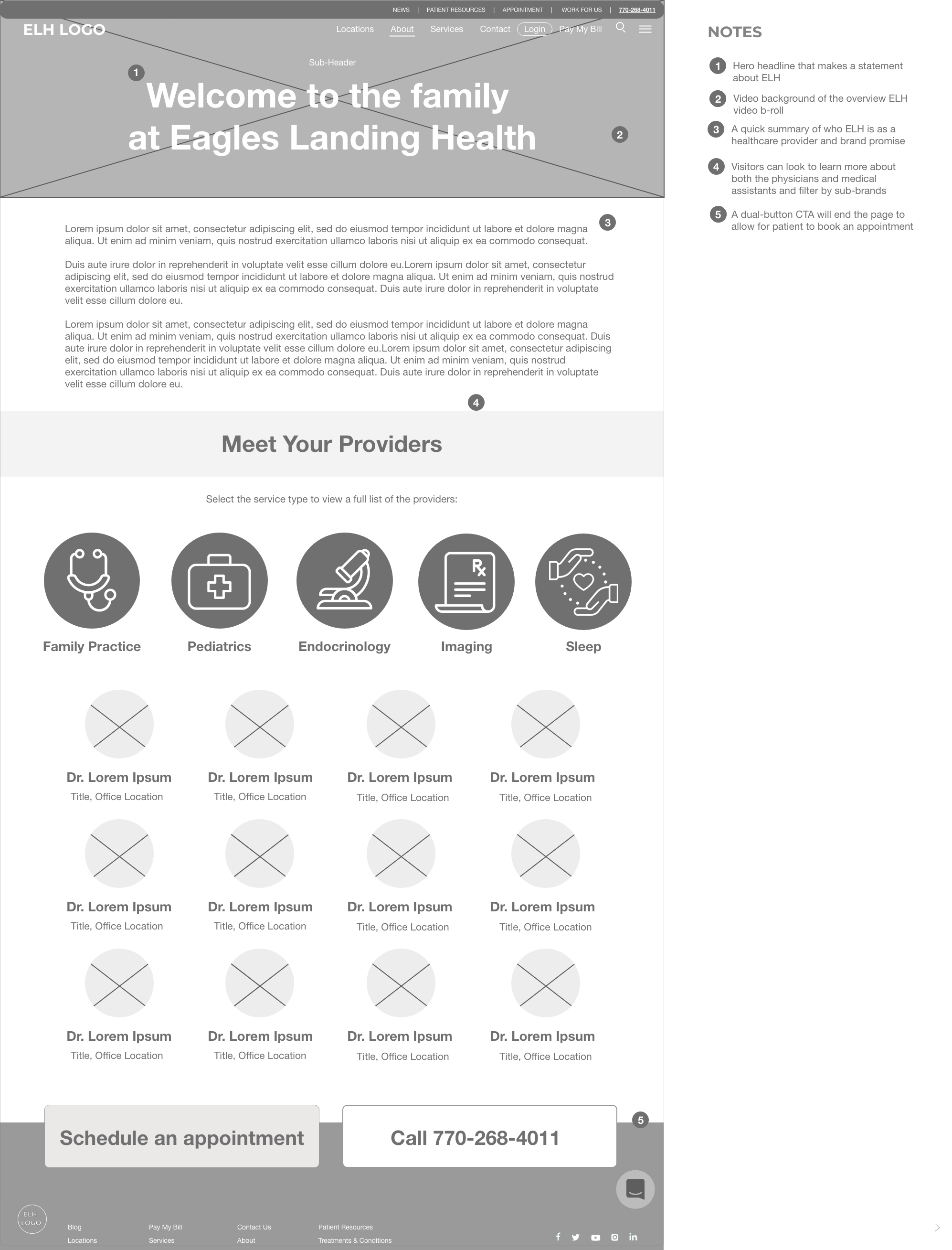
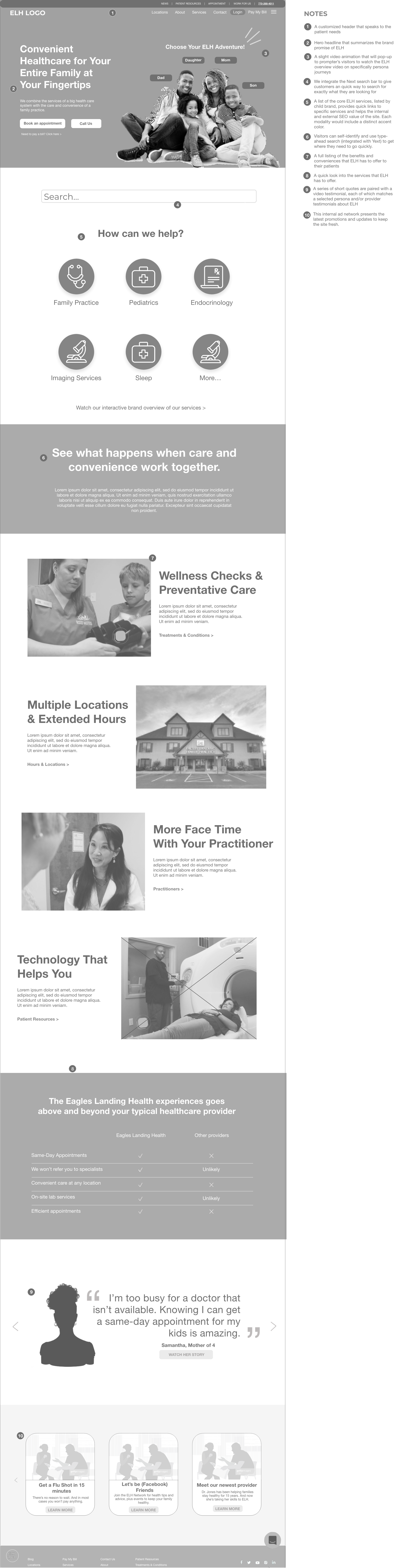
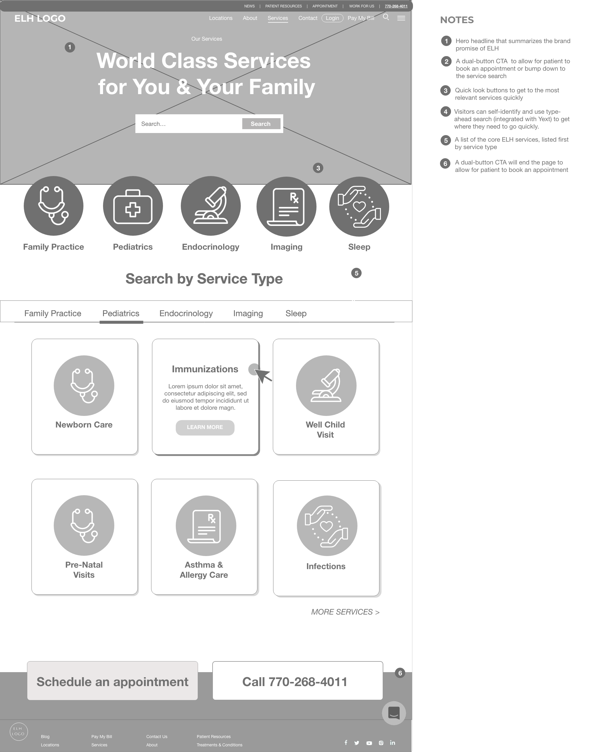
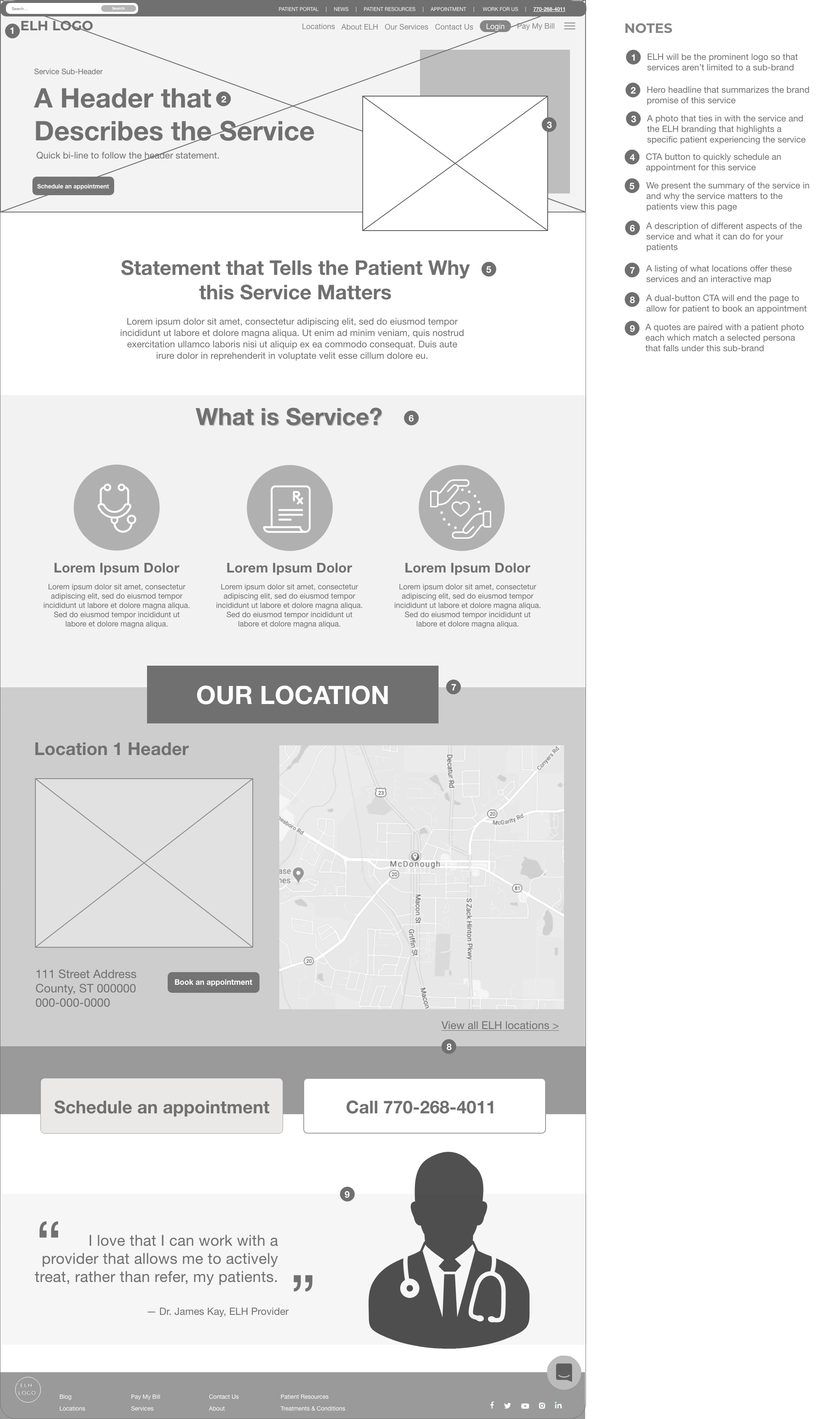
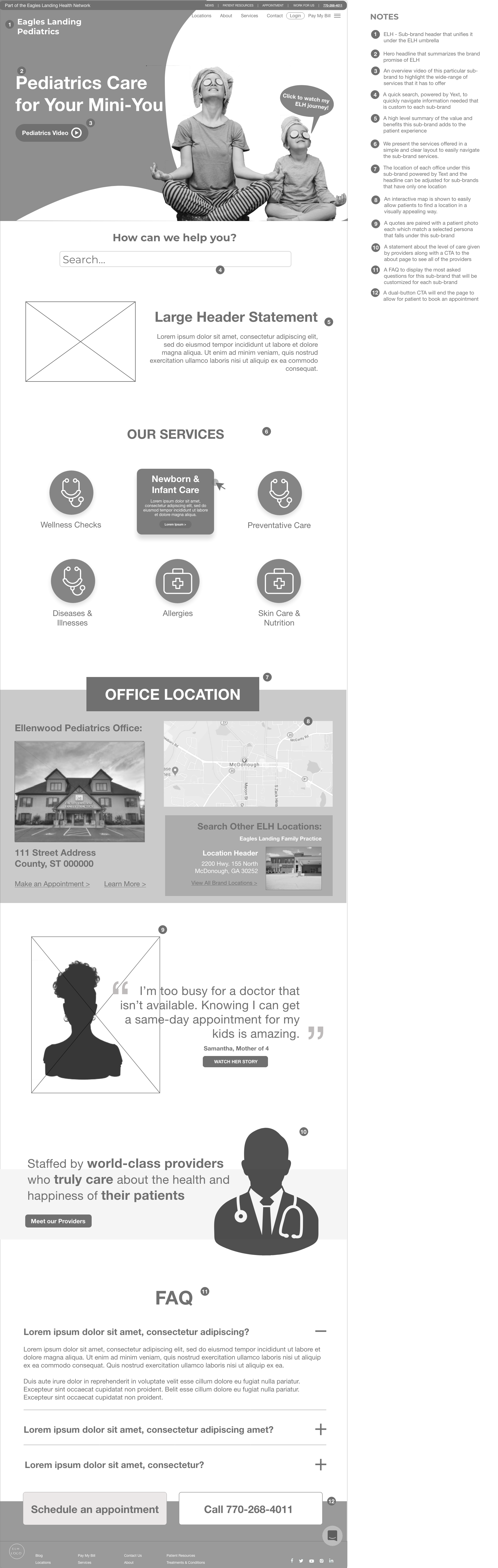
First, I’m normally the person that creates wireframes. Due to COVID and the surplus amount of assignments we received, a team member stepped in, did the research (looking at competitors) and created some clean, yet detailed wireframes. I took the time to dissect the wireframes to simplify them, communicating from a user standpoint on why less means so much more.
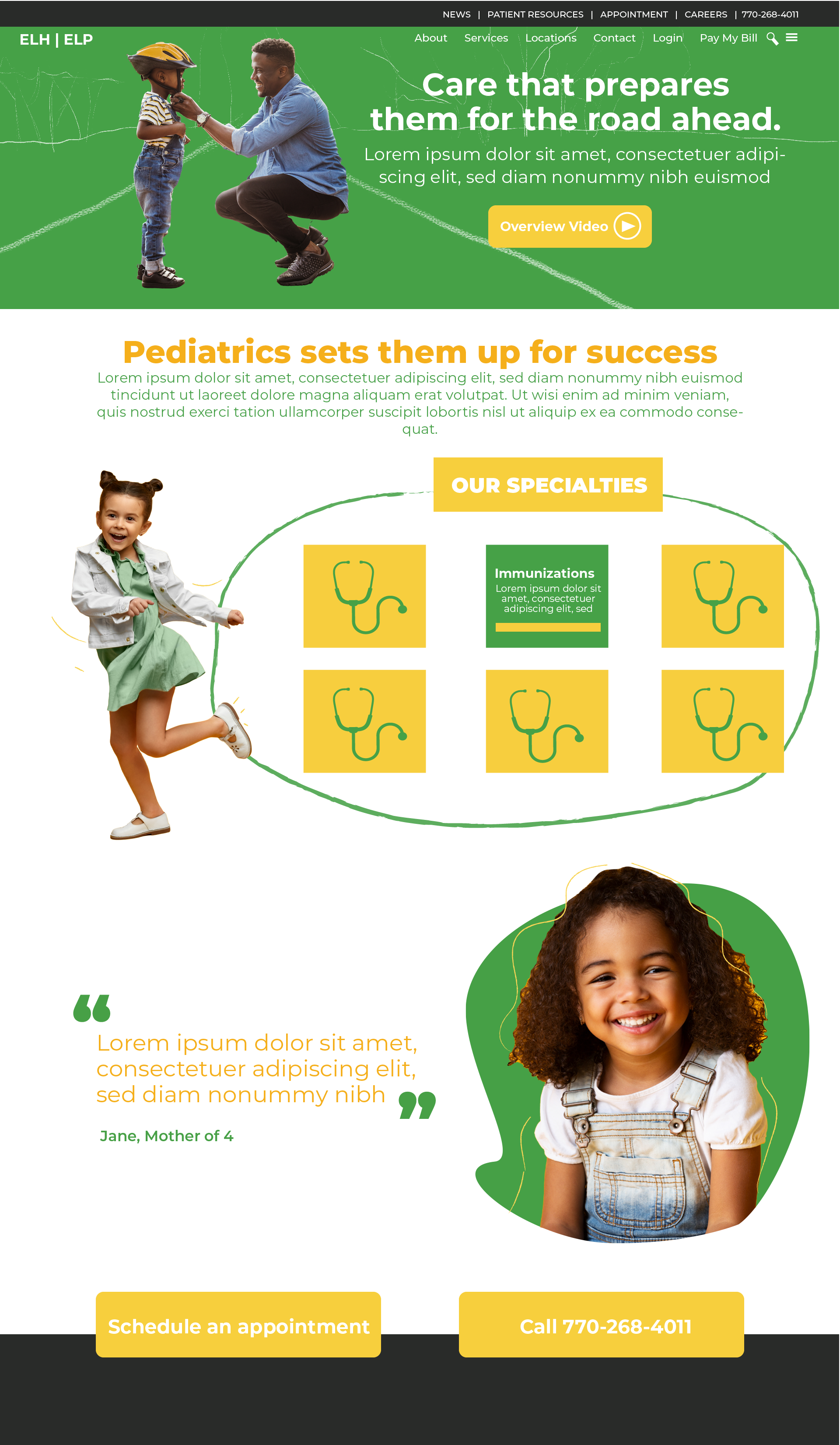
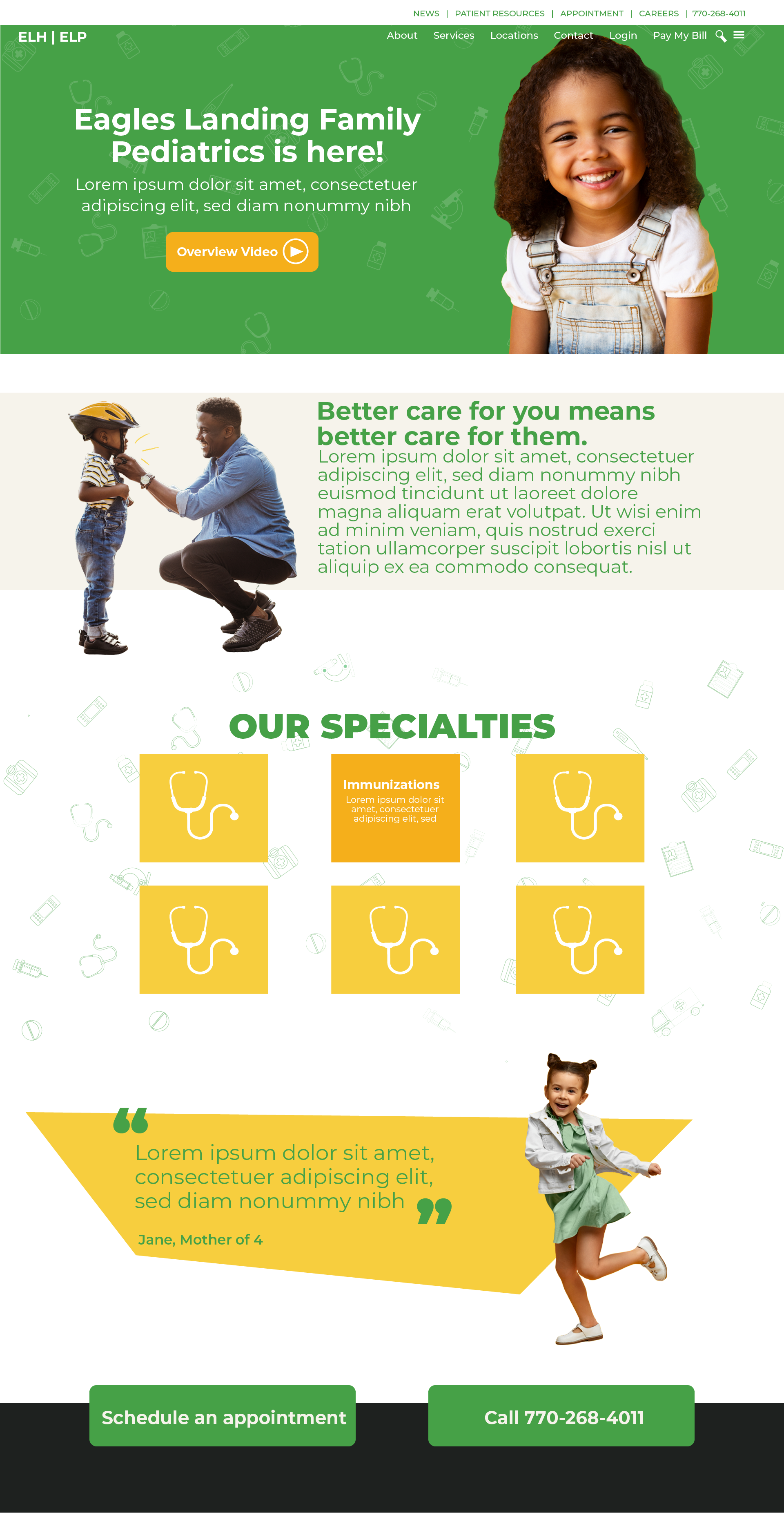
Moving in to the design phase, it took me four versions in (from ONE test page) to realize that color blocks weren’t going to work. At all. The client wanted their hero color to be prominent but wasn’t sure if it should be featured on their sub-brand pages. Pediatrics already had a solid color palette. Meanwhile, Endocrinology did not have something set in stone–other than a blue that was featured on their website. My brain nearly exploded, because there were so many moving parts to the comps, that I almost felt defeated. So I did what anyone would have done–I called my best friend, who just so happens to be a graphic designer with UX Experience.
We talked in length about the color palette. He too was stumped by the green but then we came to the ultimate conclusion that we definitely needed another color that would work well with ALL of the colors, just in case.
This is where the purple was introduced for Endocrinology. From there, we took note that the yellow-orange color from their original palette could be an element that we used across the board to help marry the colors if need be.
Color issue officially resolved.
Returning to the layout, I eliminated the blocks altogether and opted to utilize as much white space as possible. It flowed better and offered so much breathing room for the content as well as the colors. Our presentation and color proposal (for the purple) was received with mixed reviews. However, we explained to them that their growth warranted some form of distinction, especially due to the region they serviced. A household of five would likely require all three branches of their services (family practice, pediatric care, and endocrinology). So having sub-brands with strong, distinct yet memorable colors was a great idea and would not detract from the overall brand.
Needless to say, they agreed. 🙂
I can honestly say that this entire process was a learning experience. I had to lean into not only my team for feedback, but also my bestie. It was such a rewarding experience. The revamped website launched in mid-August of 2020. Their current website, https://aylohealth.com reflects the previous Eagles Landing Health/Eagles Landing Family Practice website.
-
- Homepage
-
- Service page
-
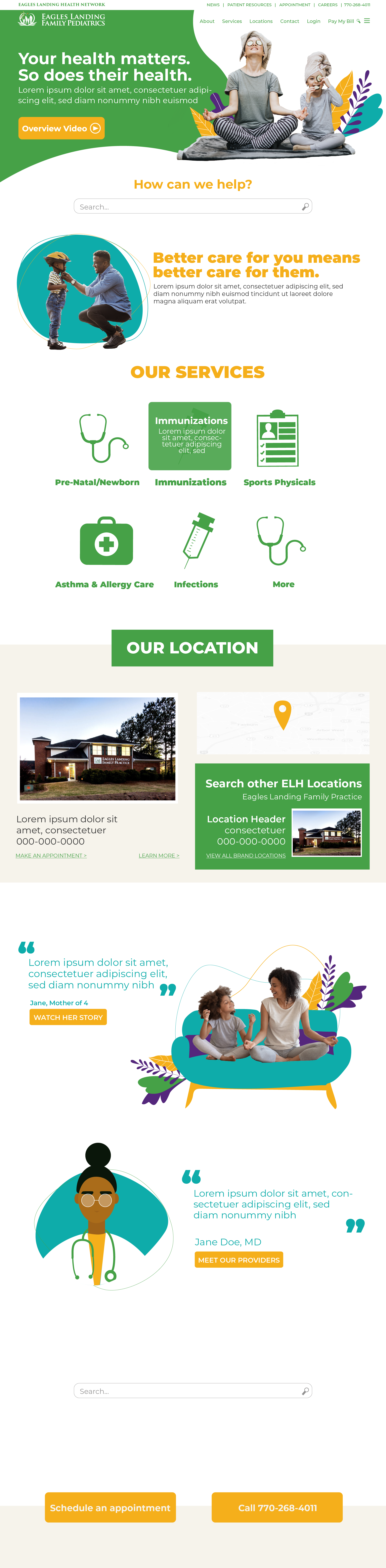
- Pediatrics
-
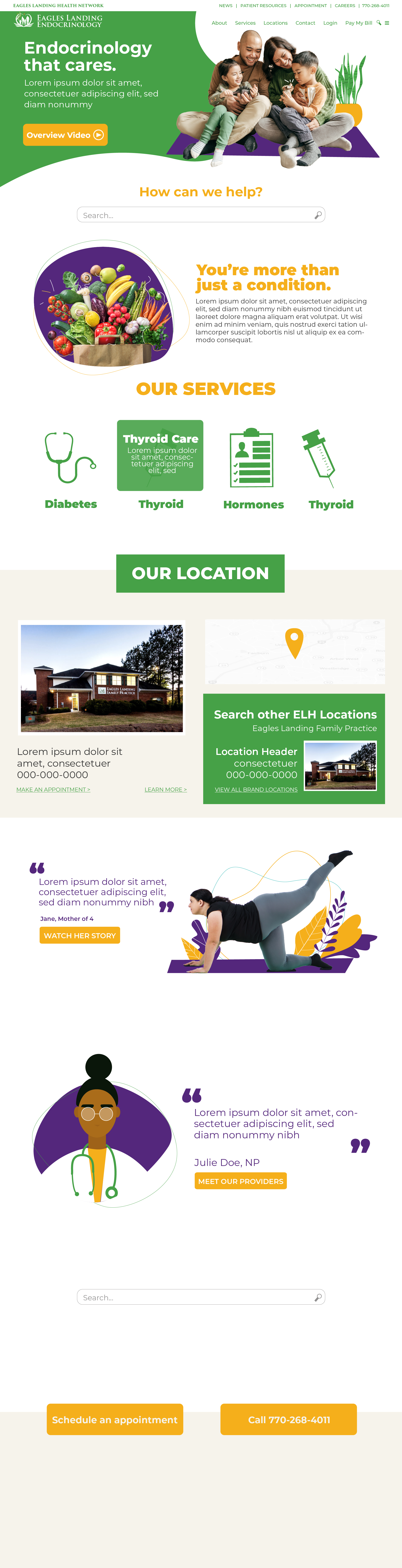
- Endocrinology
-
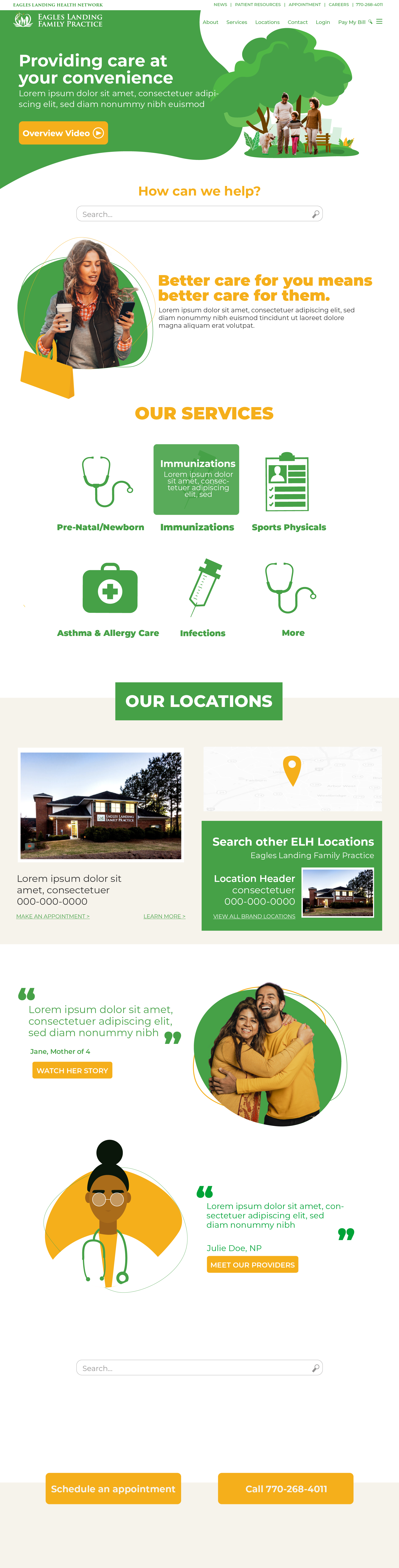
- Family Practice
- Branding
- Web