Aylo Health
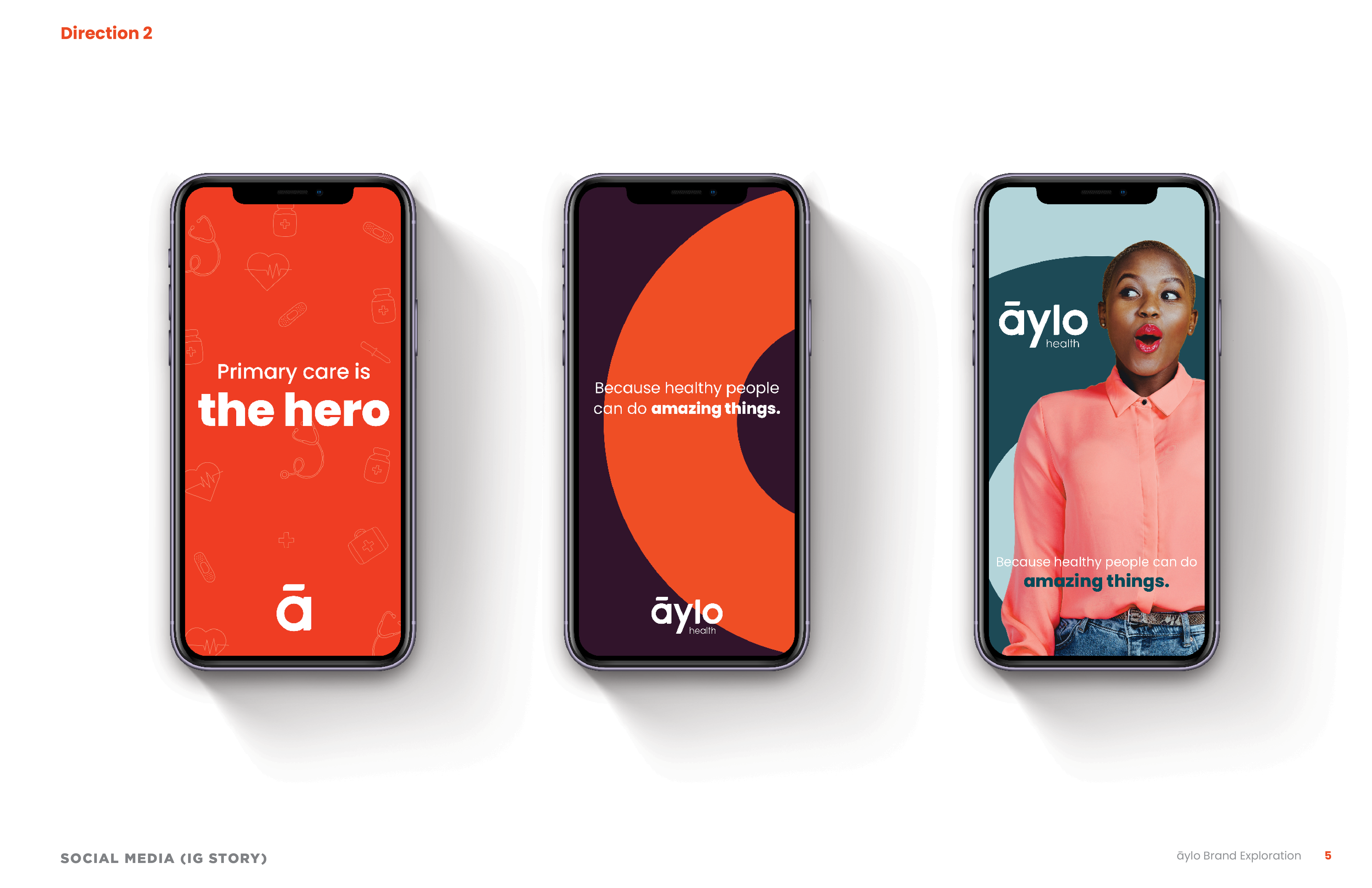
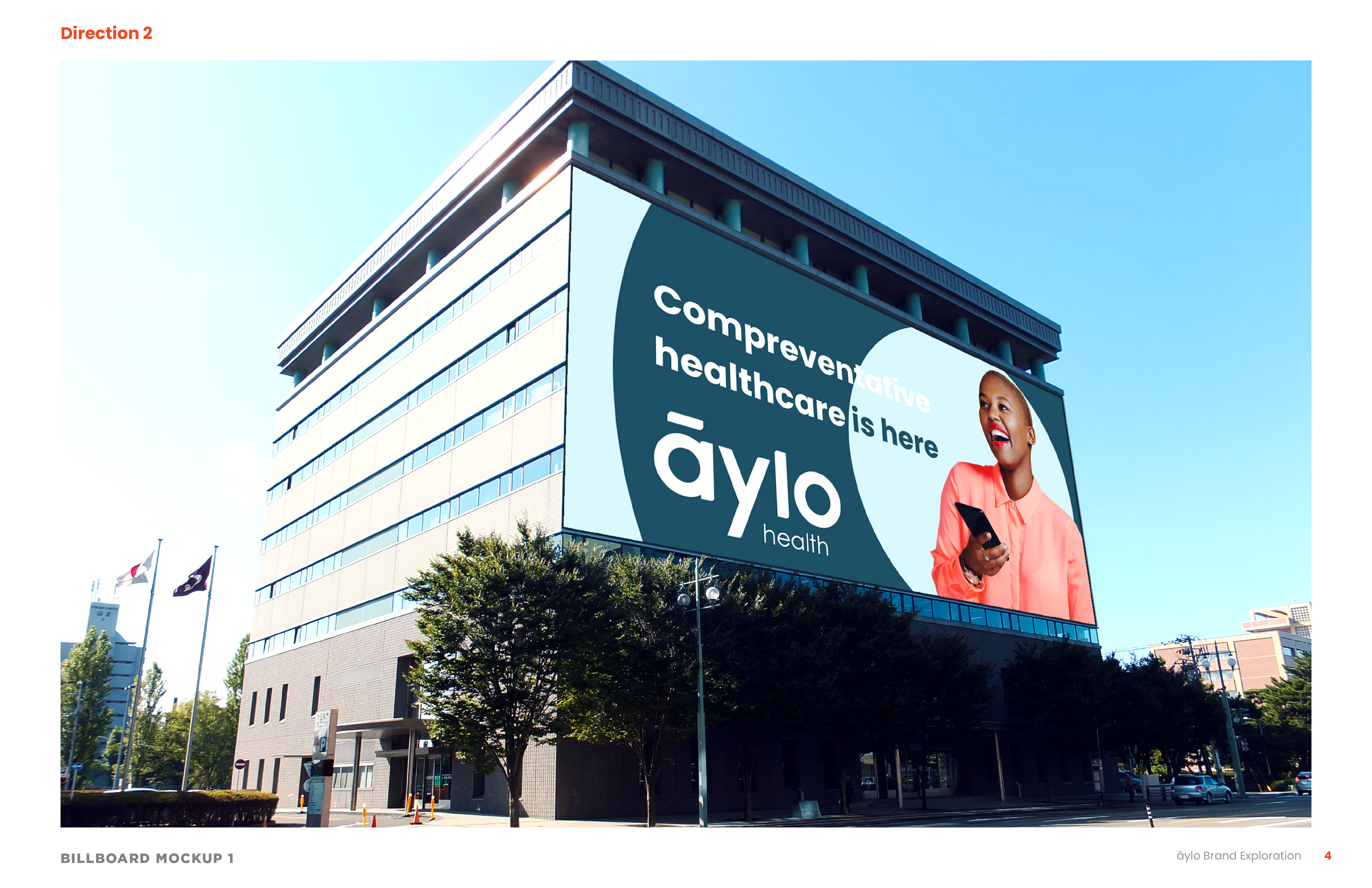
Formerly Eagles Landing Health/Eagles Landing Family Practice. I received the opportunity to help do a bit of exploration. The client wanted this brand to stand out from other healthcare brands. The lighter blue was incorporated later to add some balance/softness to the bold orange and dark blue.
This was a really fun project to have worked on. Looking back, I would do a few things differently (maybe add a cooler gray, possibly shift the messaging a bit) but it was definitely a great experience.
Target Audience
- Medical marketers
- Primary care physicians
Company Info
- Aylo Health is located in GA
- The CEO wanted to change healthcare (for the better)
- Primary care focused
- Tidbit: I wrote copy for the ELH website. Every. Single. Line. Of. Copy.
My Expertises
- Art Direction
- Brand Identity
What I Accomplished
- An audacious concept
- Brand strategy
- A concept that inspired the current visual system